

Case Study of a Site Audit

Welcome to today’s Substack. Today we’re going to be doing an audit of BowTiedOctopod’s new culinary ecommerce site. He just launched his very own niche coffee brand for coffee connoisseurs, so make sure you check out that part of the site.
I’ve been helping him out here and there and I was planning on doing a full website audit before his launch on Friday. Unfortunately, I failed in time management and started an audit the day after he went live.
So instead, I’ll be writing this and pointing out some things that I’ve found to help him and to help you see my process. He’s been gracious enough to get publicly roasted for the benefit of the jungle. 😂
Make sure to check out my post on doing a full website audit so you can follow along.
Note: When auditing a site, you don’t find issues in a linear manner. You’ll notice I jump around a bit but I’ll keep it relatively organized.
Design & UX
Two things are important to realize here. First, there’s some things I’d change about his website that I’m not going to mention here. I’m familiar with his theme and it’d take some custom coding or a theme change to fix. Neither have anywhere close to a positive ROI for him at this stage.
Second, as mentioned in the website audit checklist post, there’s the “concrete” things that I check for and the softer things that I can’t concretely make a list of all of them. These are usually found by just viewing the website and going through the customer journey.
Octopod is aware of many of these things and it’s only a matter of time before they get fixed. I’ve included things that Octopod wanted to change before I did this audit for your benefit. Not his.
Banner Image - The A spot/banner image “shop” button on the homepage is difficult to see. It needs to be more pronounced somehow. The button should be larger and/or using more contrasting colors. This also goes for the “WINTER 2021 RELEASES”.
Another thing you’ll probably notice is the category blocks below have the same button without the words/images being clickable. All known issues that I’m talking to Octopod about. Unfortunately this may be a theme limitation that will be changed at a later time.

LookBook - This is at the bottom of the homepage. I’m not exactly sure what to do with this space. I’d remove it or figure out a way to integrate it better.
Category Layout - This is a great layout on the homepage for when more products are available and you can divide everything by category. At the moment it needs some work. Half of the links go to the collections page while the other half go to the all products page. I’d advice linking to different places for each of the categories.
For example. The coffee and tea link should go to the PDP (product description page) landing page for coffee. The Knives & Cutlery link should go to the PLP (product listing page) category page for those products. The Cookware link should go to the PDP that is saying coming soon.
The other 3 category pages (and products) should be hidden until they’re ready. Or have them fully built and “coming soon” to tease the user. That sentence didn’t come out how I expected… Leaving it.
Lastly, the “home page” shouldn’t be a category. I think the confusion here lies in how categories/collections work within Shopify.
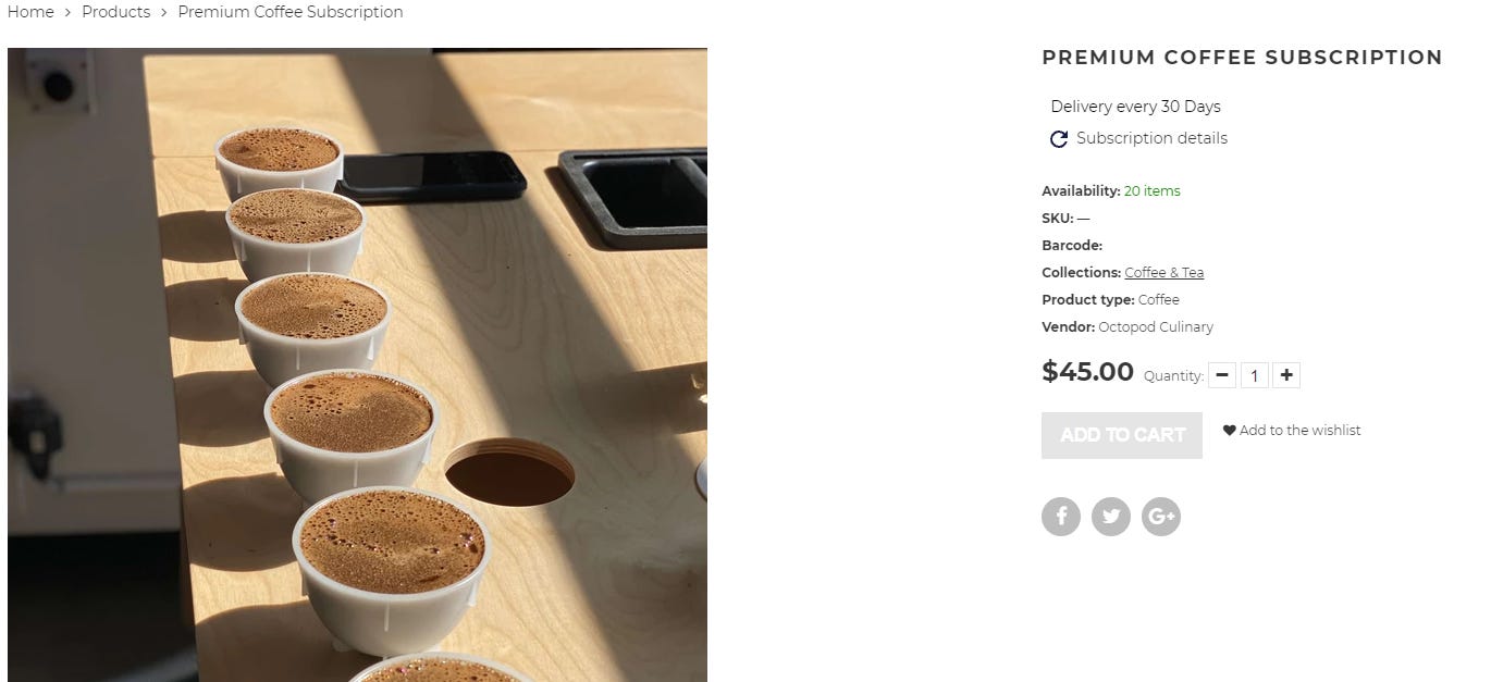
Add to Cart Button - This shouldn’t be grey. None of your cart/checkout buttons should be. A grey add to cart button mentally signals to users that the product is out of stock and can’t be added to cart. As traffic increases, this small design tweak can be detrimental to your conversion.
To add to this, the social share below the image should be the color of the social site that the user would share on.
Contact Page - YouTube link is broken. Email address on Facebook, contact us page, and policy pages don’t match.
Newsletter Link - It shouldn’t have the dropdown functionality. You should either make the link open in a new tab OR create a newsletter page that has the embedded Substack I-frame in the page.
Search Page - Found the search page via the footer. It has a stock image to the left. This is also the functionality of all of the collection pages. Remove or replace if possible.
Catalog in Header - Should be more descriptive to let users know that it’s leading them to a collection page with all products. “All Products”, “Full Collection”, “Full Catalog”, something.
Content
Footer - “About” link is broken.
Meta Descriptions - Missing on the home page and all collection pages. The PDPs automatically have meta descriptions but you’ll likely want to go back and change them.
Title Tags - Same as above.
Open Graph Protocol - You have it but not for twitter. Directions here. https://community.shopify.com/c/shopify-design/social-media-use-twitter-cards/m-p/613545
PDP Pages - Add more images, use headings (H2/H3’s) to break up the text. For example, “How Does It Work?” on the coffee PDP should be an H2.
Text should also be larger. A bit difficult to read.
The “Delivery” tab should have more information about delivery instead of being blank.
Custom 404 Page - It’s a good idea to make one that has a place for users to go if they accidently land there.
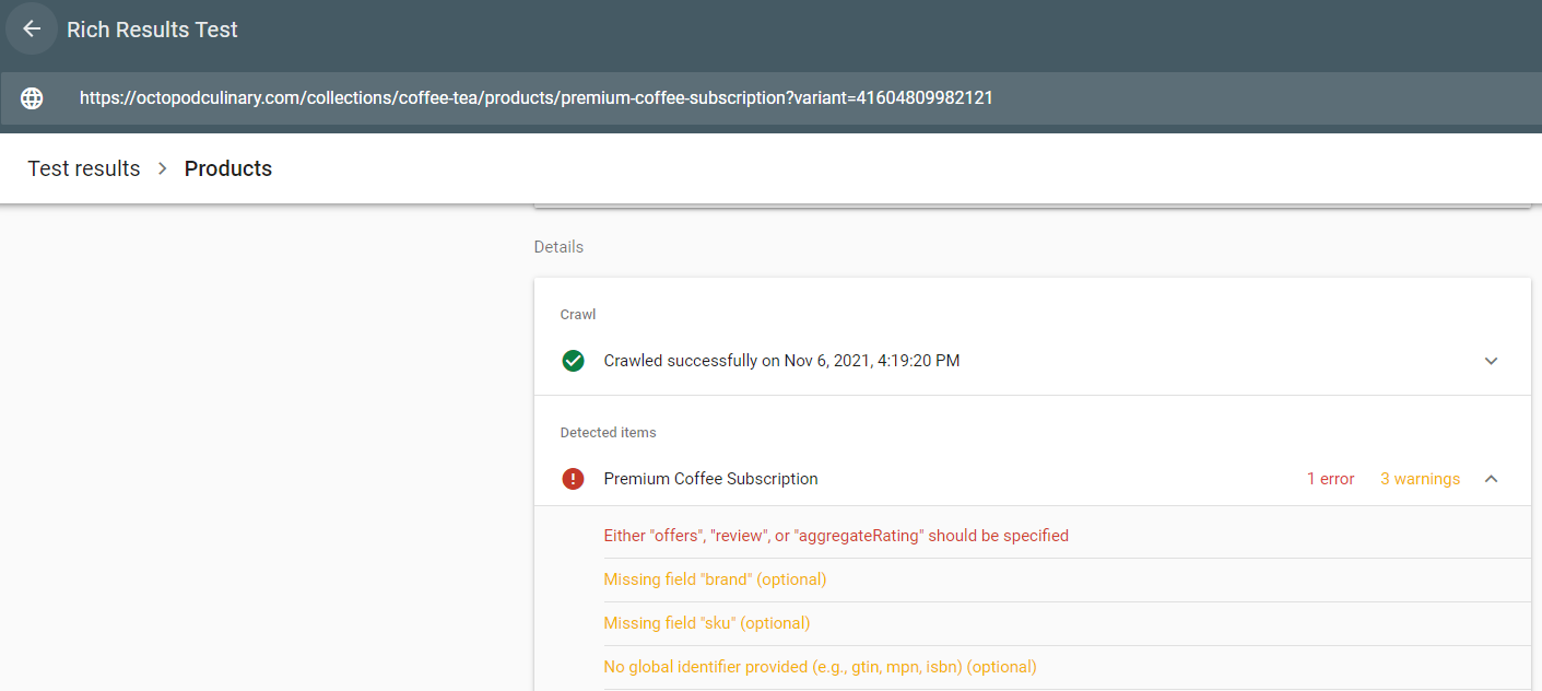
Structured Data - A few issues here. I know you’re using Judge.me as your review app. You need to contact them and *have them* implement it correctly in your theme files. Also need to add gtin, sku, and brand to your products.
Home Button - Home button in header shouldn’t have “home” and “product catalog” in header. Just make it home without a dropdown.
Category Tags - Need to get rid of most of these tags until they’re necessary. It’s unnecessary, causing a lot of duplicate pages, and could be confusing to your customers.
Technical
From a technical POV, Shopify is much more difficult to screw up than WordPress. For that reason, they’ll be a lot less that I find here.
DMARC - Missing DMARC records. This will help with email deliverability.
Site Speed - While this could improve, the juice isn’t worth the squeeze at the moment.
If you’re subscribed to this newsletter, you need to keep in mind why we’re here.
Your boss and company, no matter how nice, doesn’t care about your future. Nobody outside of a few family members and select friends care about your growth and your future.
You are the only one that can save yourself and make your life what you want it.
Single player. Just you.
This Substack is here to help you build a business and build the life that you want. I’ve laid out the basics to understand, analyze, & grow most any online business.
The best way to learn how to do this as fast as possible is to start from the beginning of the Substack. That and follow me on Twitter & Instagram.
Disclaimer: Nothing written here should be construed as legal for financial advice of any kind. These are opinions and observations, written by an anonymous cartoon Opossum, built up over years working in e-commerce & affiliate marketing.
How much do you typically charge for a site audit. Looking to get one after mine is up and running with some content.
Just saw your tweet and subbed to the stack....did I make the cut? :)